7up Global Design
Getting a crack at a global design brief was a dream opportunity from Pepsico.
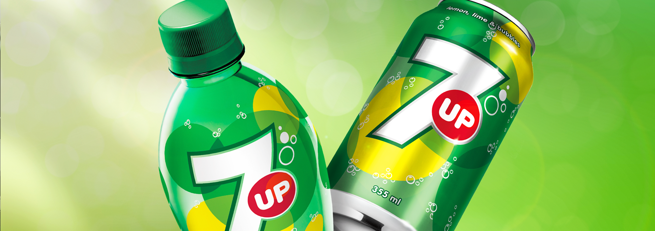
7UP’s global packaging had devolved into a cluttered mishmash of gradients, drop shadows, and competing elements.
We focused on the iconic number 7 and the red dot, creating a clean minimalist design that brought back the iconic style of the brand. A dose of graphic simplicity that went on to influence Pepsi design standards to this day.
Markets required variable representations of “fruitiness” - from more realistic to graphic.
We created deep, lush presence material - the graphic elements used in displays, vending machines, collateral.
Dive deep into the logo with these stunning ident-like spots we created with the Latam market.
“Fresh Up with 7up” became the global catch cry for the launch. Advertising featured the iconic 7 and the pop of red embedded in refreshing summer imagery.